
Utopia - Architecture exploration app

Overview
Problem
Modernist architectural heritage in Flanders is often overlooked, only gaining mainstream attention when demolition or degradation is imminent. For enthusiasts who do care, existing resources offer little help: academic inventories are a pain to navigate and available information is fragmented across many different organisations’ channels.
Solution
By making modernist architecture easier to discover, we increase the likelihood these buildings will be seen, appreciated, and ultimately protected.
Utopia is an application that makes modernist heritage genuinely discoverable through a visual-first, map-based experience.
Built-in guidance helps even casual users create personalised routes, lowering the barrier for newcomers to discover modernist architecture.
Location-based suggestions, curated routes and AI-features enable spontaneous exploration.
Details
Role: Sole designer
Timeframe: 100 hours
My responsibilities: End-to-end process. UX research, strategy, UI design, branding
Tools: Figma, FigJam, Figma Make, Maze, Claude, NotebookLM, Lovable
Research
Flanders’ Modernist heritage under threat
Recent architecture is often overlooked, only gaining mainstream attention when demolition or degradation is imminent ↗. Without generally acknowledged cultural value, modernist gems often end up renovated beyond recognition.

For enthusiasts who do care,
existing resources offer little help
At the same time, open heritage days and guided tours are quickly fully booked ↗. These events highlight the architectural qualities momentarily but once the visiting day is over, the information is hard to find (if stored at all) and spread across the different organisations’ channels, sometimes only through newsletters.

An application that makes modernist
heritage genuinely discoverable
I believe there’s great potential in a product that increases visibility for modern architecture by combining the following features:
Enable tour organisers to easily digitise their guided experiences
Provide enthusiasts with a reliable year-round platform to access architectural information
Process academic inventories into user-friendly tools for discovery, trip planning and on-site exploration. Having a programmatic quality threshold, rather than relying on manual curation, allows the product to scale by incorporating inventories from multiple regions.
I analyzed 9 apps across wayfinding,
route planning, and cultural discovery
Apps by major cultural events like the Olympics, Milan Design Week or World Expos were a great reference for competitive analysis. These apps excel at creating wayfinding systems that help visitors navigate cities while discovering festival venues and installations. They share similar goals to this project's but are created with substantially more tourism funding and corporate sponsorship.
I conducted five 45-minute interviews with architecture enthusiasts at varying experience levels. All confirmed that heritage data beyond major landmarks is largely inaccessible and no platform exists for discovering lesser-known buildings.

User interviews validated the project's viability and informed a design philosophy centered on a visual-first, map-based experience.


User interviews informed two personas: the heritage detective with an academic approach, and the more casual aesthetic explorer.
Ideation


Inspired by the most expressed needs, I created
mid-fi wireframes for a first round of usability tests.
Participants passively collect stops over years, often choosing destinations based on the highest concentration of saved buildings. The app's map-based interface visually distinguishes favourited stops, making clusters easy to spot.
Once on-site, users want as little screen-time as possible. They do all the research beforehand. That information is scattered across podcasts, books, inventories and articles. Each building’s detail page includes a “More info” tab that gathers these links to external resources.
A recurring frustration was encountering unannounced renovations or closures despite Google Maps showing buildings as open. To address this, I added a report function allowing users to flag outdated information.
Evaluative research

While participants successfully completed all tasks, there were lots of suggestions to improve usability. The first version dropped users directly into a map view with dots representing buildings. To users without prior knowledge of modernist architecture, it felt like they were in a library without knowing what to browse for.
I used Figma Make to rapidly test different
organisational structures for a new homepage
The revised information architecture separates the experience into two phases: a “discovery phase” focused on individual stops, and a “planning phase” centered on route creation.

In "Discover", users can toggle between a map view to easily locate stops and a list view with large images for visual browsing.
in "Routes", users plan their trips by consulting
curated routes or creating their own.
A second round of testing confirmed once again the importance of pre-curated content. Even when creating own custom routes, users said they'd prefer to start from a curated one and adjust from there.
The new homepage helps even casual users
in discovering new buildings and planning routes
The homepage offers multiple pathways into the content: personalised suggestions, curated routes, location-based recommendations for spontaneous exploration, and AI-powered route creation.
The second round of usability testing confirmed that the major problems from the first round of testing are addressed. The feedback mainly related to small usability improvements.
Branding
World's fairs of the post-war era gave modernist architects an unparalleled playground to experiment with newly available materials and push their structural limits, resulting in spaces that radiated a unique kind of forward-looking optimism.
This spirit of utopian thinking is precisely what the app celebrates, and it's reflected in the name: Utopia.

The overlapping circle motif draws inspiration from the wayfinding system designed for Expo '70 in Osaka.
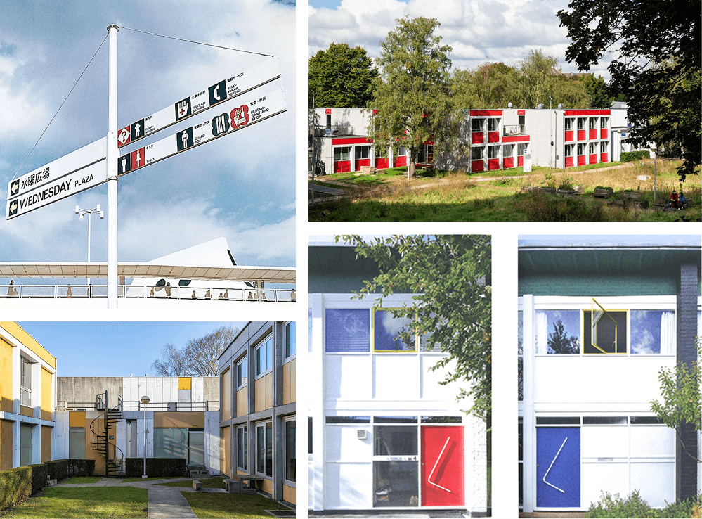
Modernist design is often white with primary colour accents.

I extended this aesthetic into the design of the app, with the primary colours guiding users towards the primary action.
I’ve used basic shapes that stack as lists, creating rhythms reflecting those found in the aforementioned facades.
Retrospective

UI Kit
The broader ambition is this: by making modernist architecture easier to discover, we increase the likelihood these buildings will be seen, appreciated, and ultimately protected.
Research uncovered that academics working with heritage inventories are aware of their accessibility challenges. The organisations managing these inventories are actively seeking partners for initiatives that make their data more usable for the public.
Next steps include confirming that these inventories are freely accessible and determine how much data processing can be automated. User research showed curation is critical for Routes, pointing toward partnerships with heritage organisations for expertise and local knowledge.
Since completing the project, I’ve partnered with Toerist Modernist to submit a funding proposal ↗ to Onroerend Erfgoed Vlaanderen to build the app. To strengthen our case, I'm currently building a small version of the app in Lovable. The "Discover" phase is live and can be experience here ↗.
d-(^_^)z
Designed in Figma, built in Framer.
3D models made with Polycam. Based in Ghent.