
Wikipedia - Trails feature

Overview
Problem
Wikipedia faces strategic tension where its content is becoming more vital to the internet’s infrastructure while simultaneously becoming less visible to users. The internet's favourite encyclopaedia isn't optimised for modern browse-expectations, causing them to loose many users to short-form content.
Solution
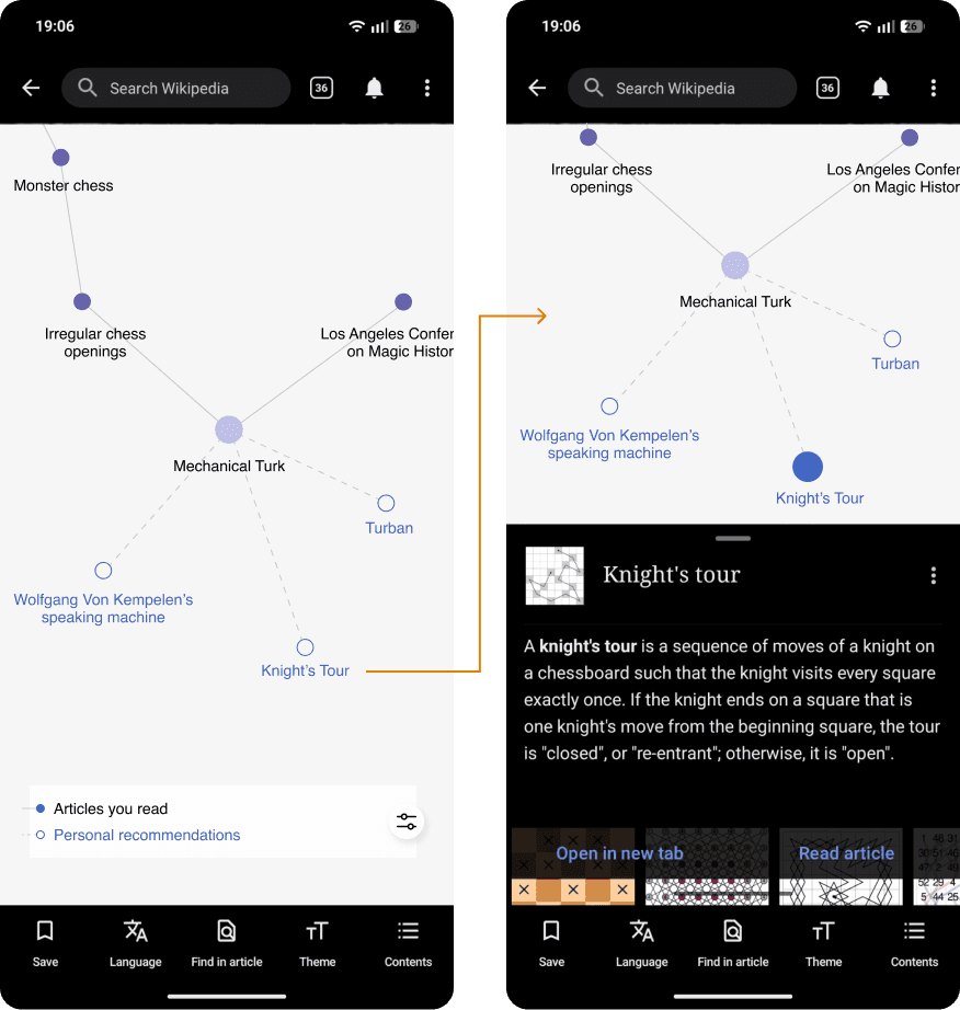
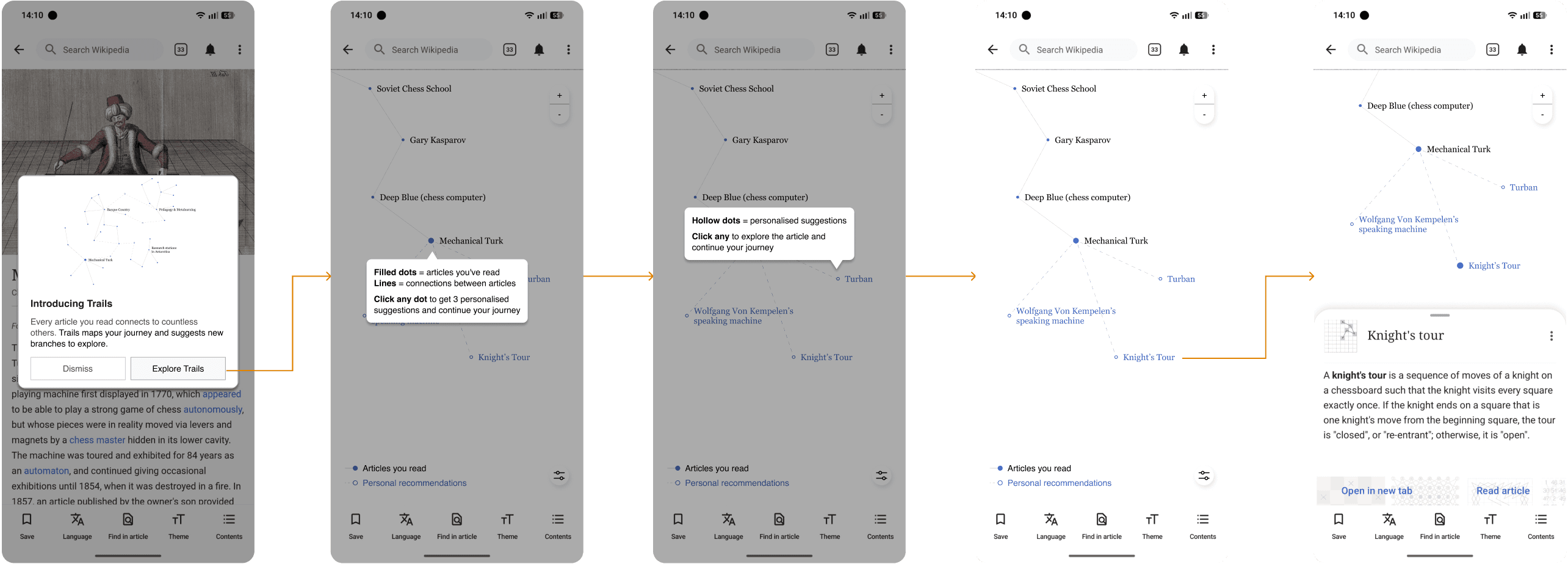
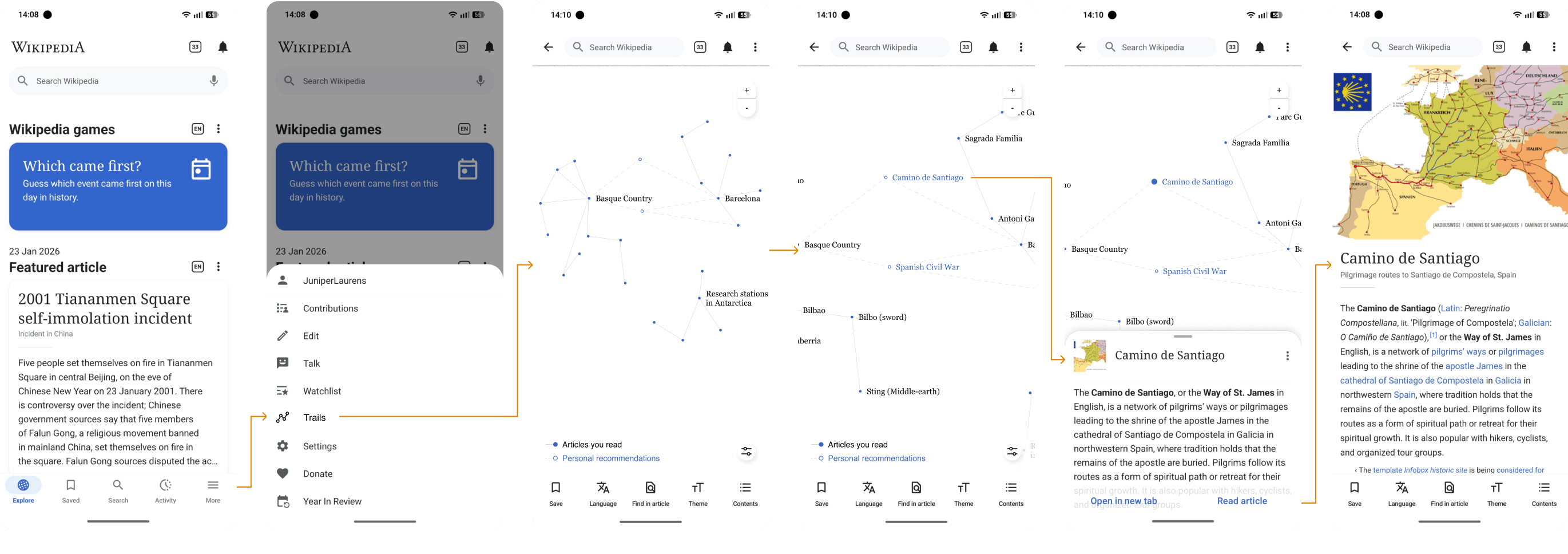
A feature that turns a linear reading session into a visual experience that looks - and feels - more like exploration. By browsing Wikipedia, users generate a network graph that maps the connections between articles they already read. Each node represents a visited article: tapping one surfaces personalised recommendations that branch outward.
The feature enables splitting rabbit hole sessions up in multiple short sessions, aligning with modern browse behaviours fitting the short-form era.
Finally enables users to start sessions in the Wikipedia app through meaningful, personalised suggestions.
Users create a visual record of their own curiosity over time. The feature doubles as a kind of self-portrait, a map of what you found worth knowing.
Details
Role: Sole designer
Timeframe: 70 hours
My responsibilities: End-to-end process. UX research, strategy, UI design
Tools: Figma, FigJam, Figma Make, Claude, NotebookLM, Lovable
Research

Wikipedia's pragmatism
as a brand: the problem
Opening the app can feel like opening a… Well, an encyclopedia. It’s not flashy, feels outdated and doesn’t try to keep you there. I realise this pragmatism builds trust, but it comes at a cost.
Wikipedia has been quietly losing visibility, even as its importance has never been greater. ↗ It remains the internet's foremost neutral source of information and a critical foundation for LLMs.
Opportunity to recapture users
lost to short-form content
Creators on YouTube Shorts and TikTok are genuinely skilled at pulling audiences in, but the information tends to be surface-level, and the narrative is almost always shaped by the person delivering it.

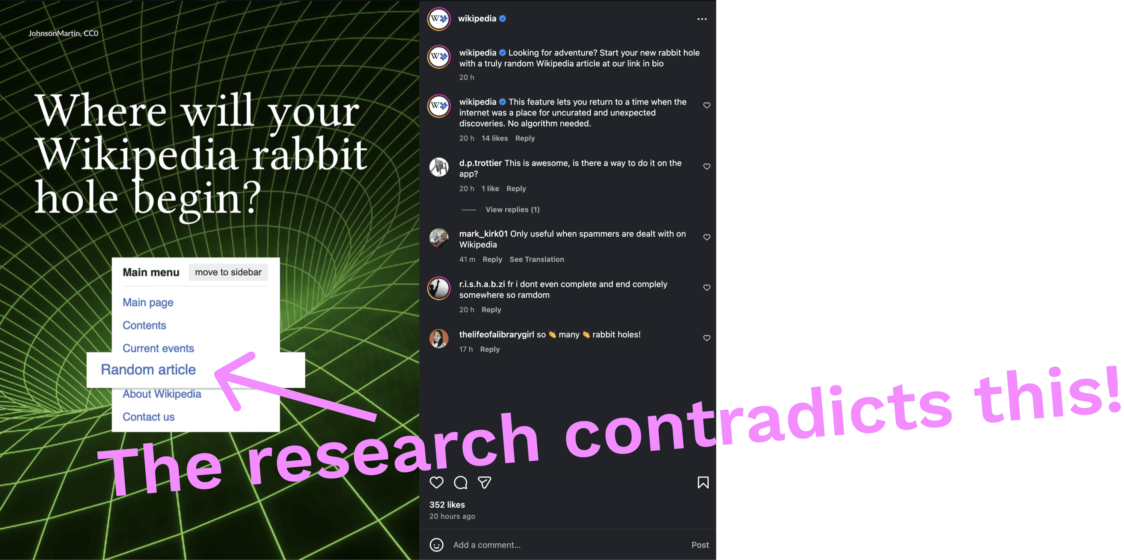
What's striking is that third parties have found better entry points into Wikipedia's content than Wikipedia itself offers. Content creators and apps like NearbyWiki simply present articles in a way that actually draws people in.
This project explores how to bring that energy back to Wikipedia itself, by designing for the rabbit hole: the particular pleasure of following your curiosity from one article to the next. The Wikipedia app is the natural place to experiment with this, as the team has said themselves that the app is their primary space for trying new ideas ↗.

Users fondly remember getting
lost in rabbit holes
I interviewed five Wikipedia users, mixing desktop and mobile preferences, and deliberately including participants who used to engage with it far more than they do today to understand not just how people use Wikipedia, but why some have stopped.
Initial user interviews confirmed the hypothesis. Participants spoke warmly about the experience of falling down Wikipedia rabbit holes, but admit it rarely happens anymore as attention spans have shortened and short-form content providers have won the attention economy.
Another interesting finding was about behaviour patterns. Users don’t browse Wikipedia randomly, they consistently return to the same interest areas (e.g. 20th century history, soccer, contemporary jazz). Yet there’s no way to pick up where they left off, or to be guided toward something adjacent to what they already love.


User interviews led to the creation of 2 personas
This is the opportunity. Wikipedia already knows what users read, how far they go, and where they drop off. A feature that helps users resume a learning journey, or branch into a related thread, could make the app feel less like a reference tool and more like a genuine companion for curiosity.
Randomised content feels impersonal and
rarely aligns with often revisited interests
Wikipedia sessions rarely begin on Wikipedia. Someone watches a film and wonders about a reference. They're halfway through a history podcast and want to see how something connects to something else they once read. Wikipedia feeds the curiosity awoken by other media.
The app does offer discovery features such as Random Article, Article of the Day, On This Day, but interviews showed that they feel disconnected from anything personal.
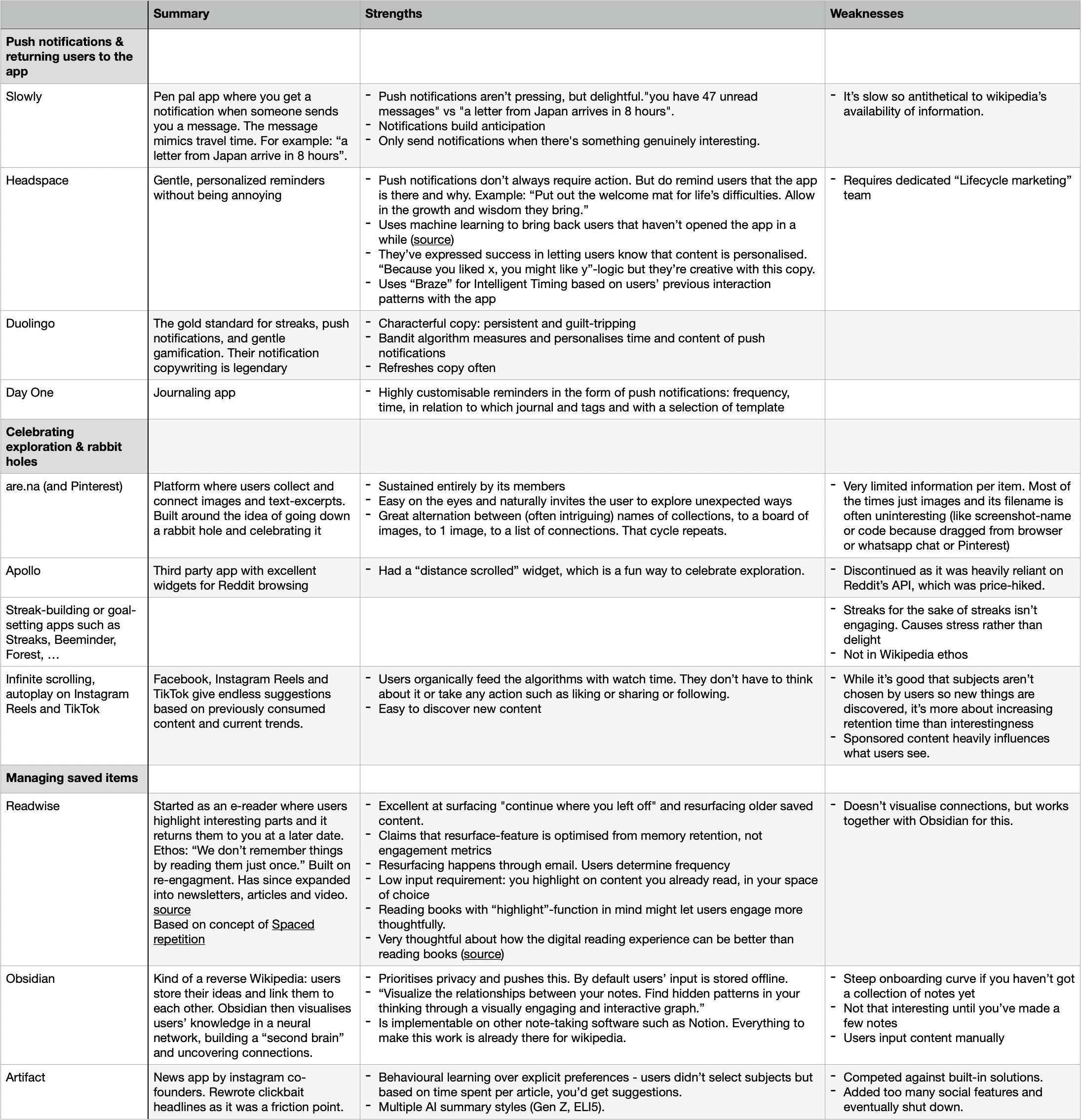
Competitive analysis
Competitive analysis showed that most apps resolve discovery through explicit personalisation by following selected topics or subscribing to specific sources. But that approach doesn't align with what makes Wikipedia exploration feel magical. The joy isn't in reading about jazz. It's in starting on Miles Davis, following a link to the French Quarter, then somehow ending up on the history of absinthe. The path itself is the experience.
The goal, then, isn't to predict what a user wants to read next, it's to make visible the path they're already walking, and make it easier to keep walking.
Ideation
Lo-fi wireframes: the Trails-feature visualises the path of visited articles and suggests ways to keep walking.
My solution: a network graph that maps the connections between articles a user has already read. Each node represents a visited article: tapping one surfaces personalised recommendations that branch outward, turning what was a linear reading session into something that looks - and feels - more like exploration. This would keep everything that users love about Wikipedia intact, as the articles themselves are untouched.
It reframes the rabbit hole as something worth returning to, and it aligns with how Wikipedia has positioned the app as the right place to experiment.
Evaluative research
Task flow 01: Access your first Trail
Task flow 02: Revisit Trail and expand on it

Task flow 03: Find specific articles through Trails
The visual approach to exploring the rabbit hole across multiple shorter sessions resonated strongly with those drawn away by short-form content.
Unexpectedly, users loved seeing a visual record of their own curiosity over time. Several users compared it to “Spotify Wrapped, but for knowledge”. The feature doubles as a kind of self-portrait, a map of what you found worth knowing.
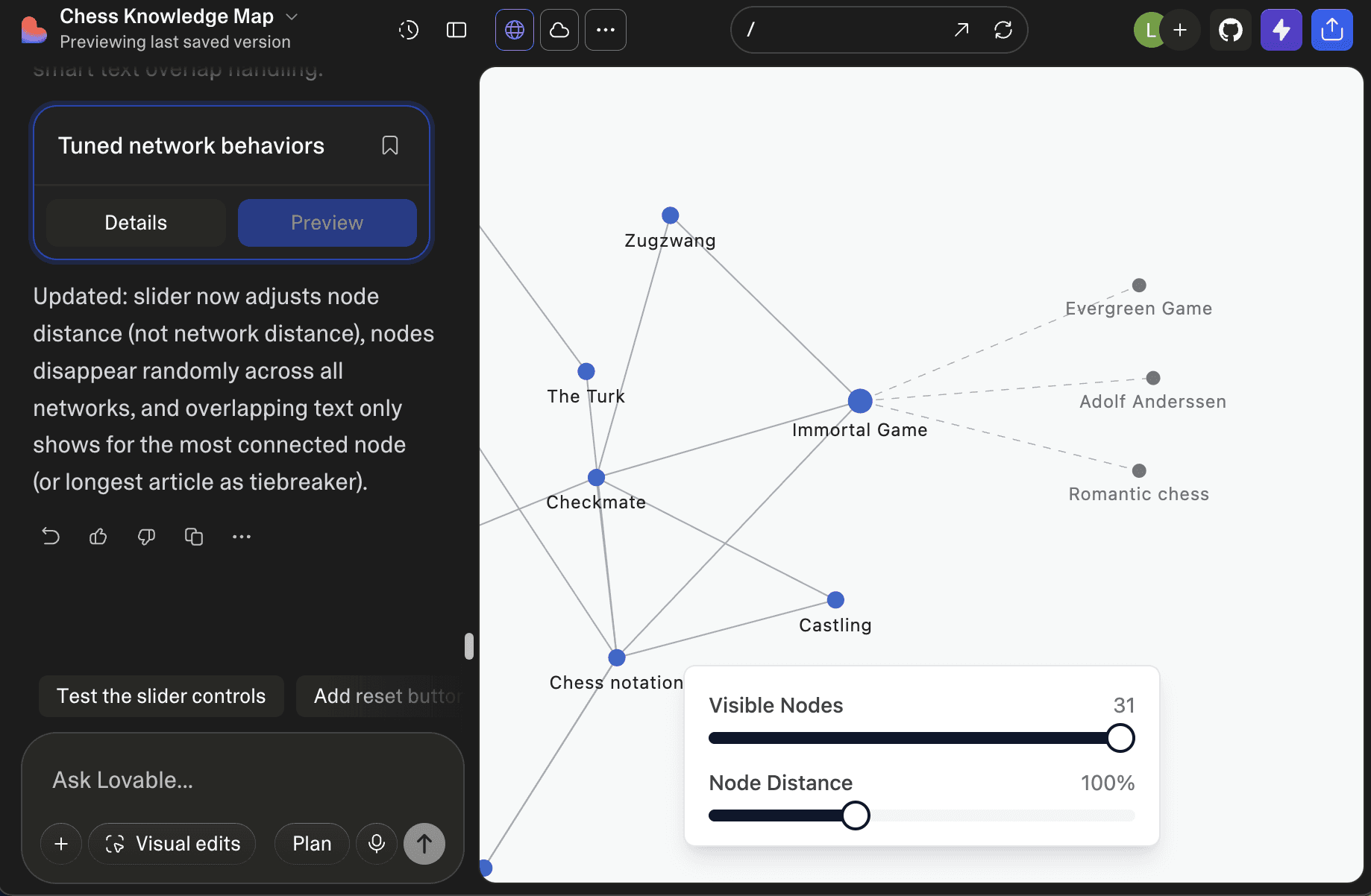
Testing also surfaced that with prolonged use, accumulated nodes create visual clutter that makes the graph harder to navigate, and traditional filters don't translate well to a visual browsing context. Additionally, users wanted filtering to feel immediate and see happen in real time, not as a setting hidden behind a menu. I addressed this by adding sliders that manage the visual density.

Early in the process it became clear that a feature built around the experience of visual exploration can't be meaningfully evaluated through static Figma screens. It needs to move, respond, and behave like the real thing.
Using Lovable, I had a working prototype within 25 minutes that went on to anchor every presentation and eventually serve as the basis for usability testing. I used Figma for working out how the feature sits within Wikipedia’s existing structure and UI, and Lovable for experiencing the feature itself.
AI-prototyping proved especially valuable when addressing the visual clutter problem surfaced in testing.

Hi-fi wireframes: revised filters focus
solely on managing the visual load.
I ended up at two sliders for purely visual load management. One slider manages the number of nodes displayed (determined by time), and another manages information density (determined by distance between nodes). A dropdown reveals personalised categories to manage which article titles remain visible when hiding titles to prevent overlapping text.
Retrospective
Conclusion
This feature aligns the app with modern browse behaviours without compromising its existing qualities.
Usability testing proved its potential with users who had drifted toward short-form content. Tellingly, several noted they wouldn't feel guilty spending hours with this because they'd be learning. The feature modernises the experience for shorter attention spans without trying to become TikTok. It accelerates discovery while keeping Wikipedia's values intact.
And it has room to grow. Once the graph exists, Wikipedia knows enough about a user's trails to reach out in ways that feel genuinely relevant rather than intrusive. Imagine being notified that a rabbit hole you're following today is about to intersect with one you explored years ago: an invitation to revisit an old path, make a new connection, and find another reason to come back, and to keep going.
Trade-offs
One limitation worth naming: even regular Wikipedia users had little awareness that a dedicated app exists. Ideally, future testing would include established app users to see how the feature lands with that audience specifically.
One area that warrants deeper exploration is data privacy. The feature relies on tracking browsing history, and whether that aligns with Wikipedia's existing approach to collecting and storing user data is something that would need to be resolved in a real development process.
d-(^_^)z
Designed in Figma, built in Framer.
3D models made with Polycam. Based in Ghent.